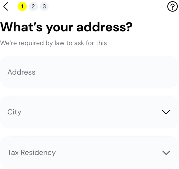
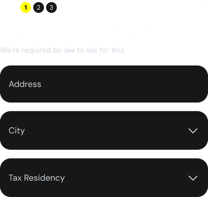
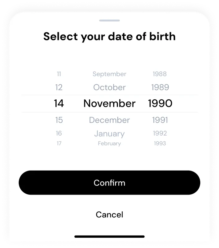
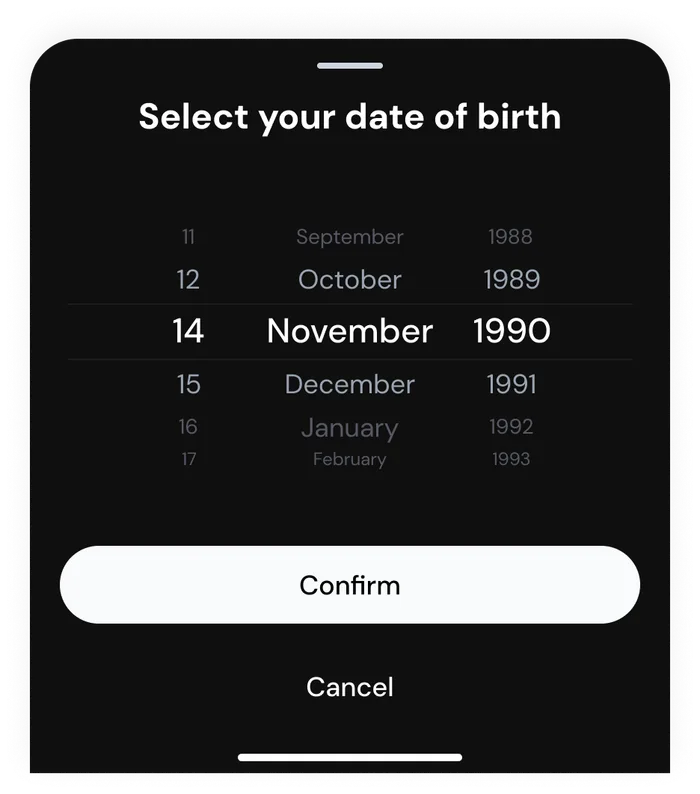
I led the redesign of Thndr’s sign-up and KYC flow, rebuilding it around one decision per screen, and grew the token-based design system that carries it in light and dark mode.
Before
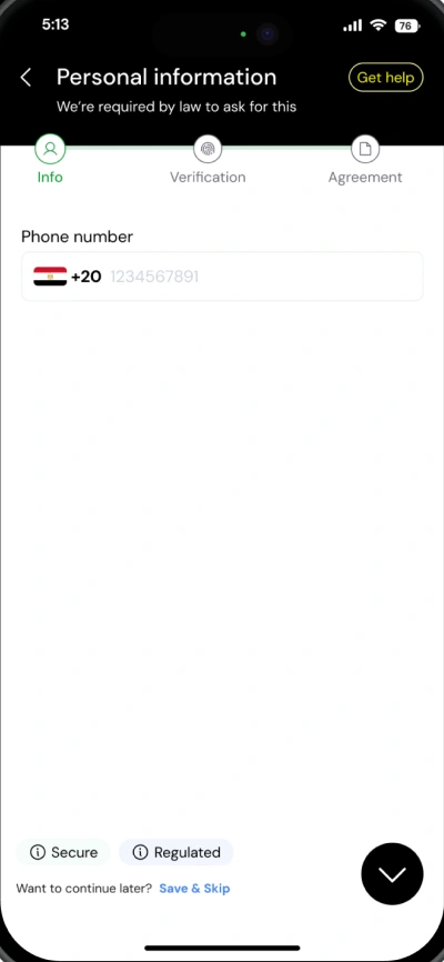
One long form, three abstract steps
After
Sign-up, before and after
Company
Thndr
Discipline
User interface design
My role
Lead the end-to-end design process
Identify experience gaps
Collaborate with brand and marketing
Design system and engineering collaboration
Light and dark mode tokens setup
Interaction design and advanced prototyping
Usability testing sessions
Engineering handoff
The challenge
Every new investor on Thndr has to clear KYC before their first trade: identity, employment, tax residency and a photo of an official ID. The regulation isn’t negotiable. The experience around it was.
Problem
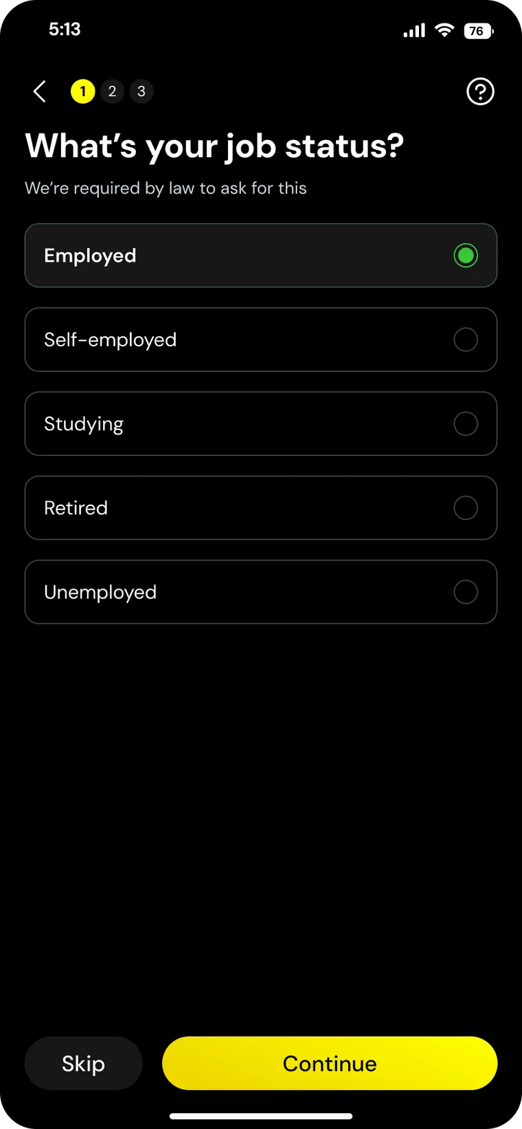
Sign-up opened straight into forms, grouped under abstract steps (Info, Verification, Agreement), before a first-time investor had seen what the app offered. Screens were designed one at a time rather than from shared components, so consistency, and a dark mode, were hard to scale.
Goal
Make activation feel like a few easy decisions instead of paperwork, and build it on a token-based design system the rest of the product could grow into.
What was done
01 Benchmarking
Benchmarked fintech onboarding flows across MENA and Europe, extracting patterns and insights that informed improvements in user activation and experience quality. This led to simplifying the onboarding flow, reducing friction in KYC steps, and aligning with familiar patterns users already trust.
02 Defining the UI direction and brand assets
Owned the end-to-end onboarding design, from wireframes to refined UI, iterating with cross-functional teams. Designed with scalability in mind, ensuring the evolving design system could support broader product flows and future features.
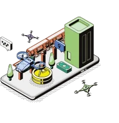
Security
Face ID
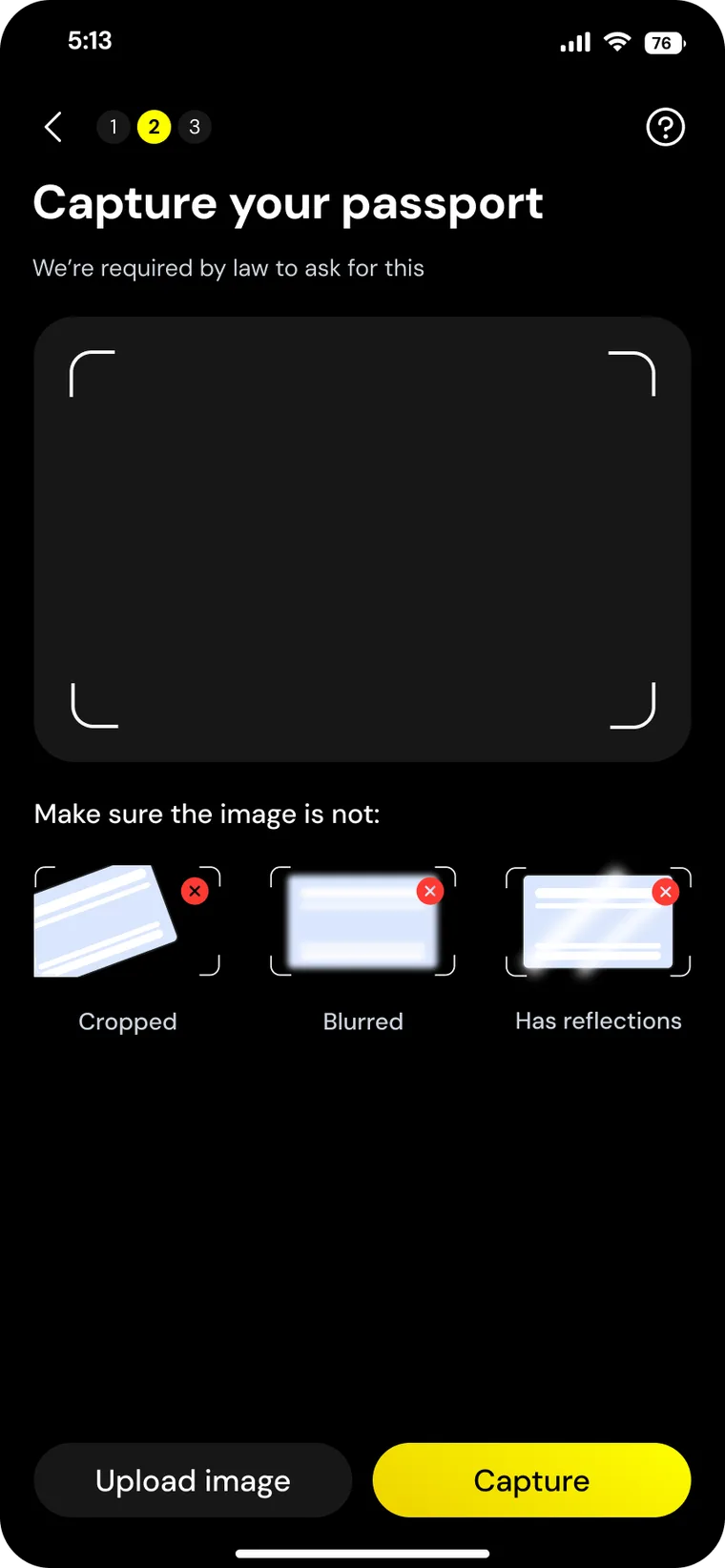
ID capture
Photo rules
Marketplace
Delivery
Storefront
Thndr coin
03 UI design
Translated brand assets into cohesive light and dark mode experiences, aligning closely with engineering, product and brand to ensure consistency and smooth implementation.
Click to enlarge
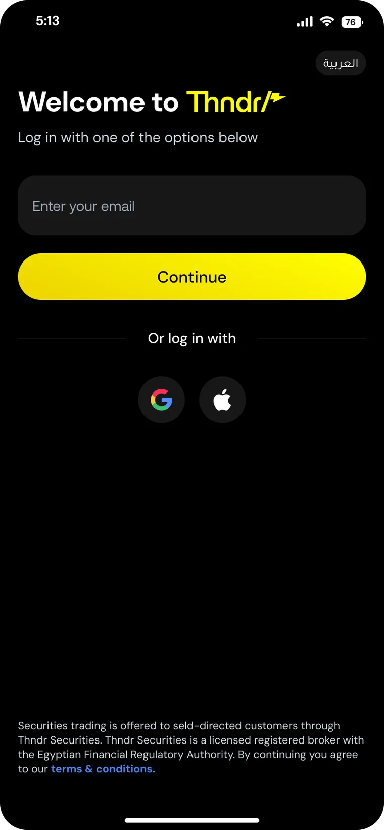
Log in — Entry point, kept to one decision.
Click to enlarge
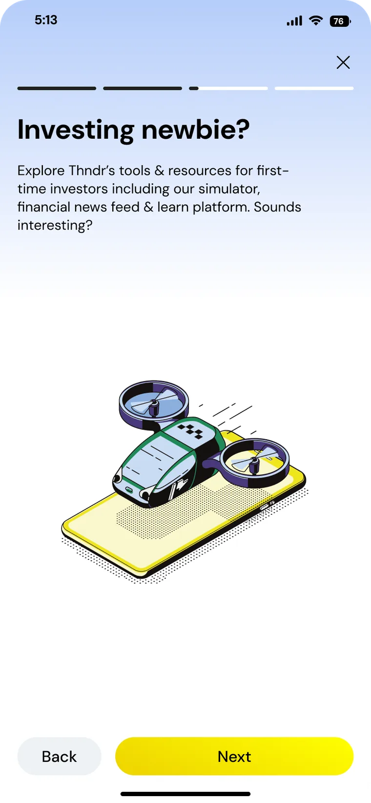
First-time investors — Sets expectations before any form appears.
Click to enlarge
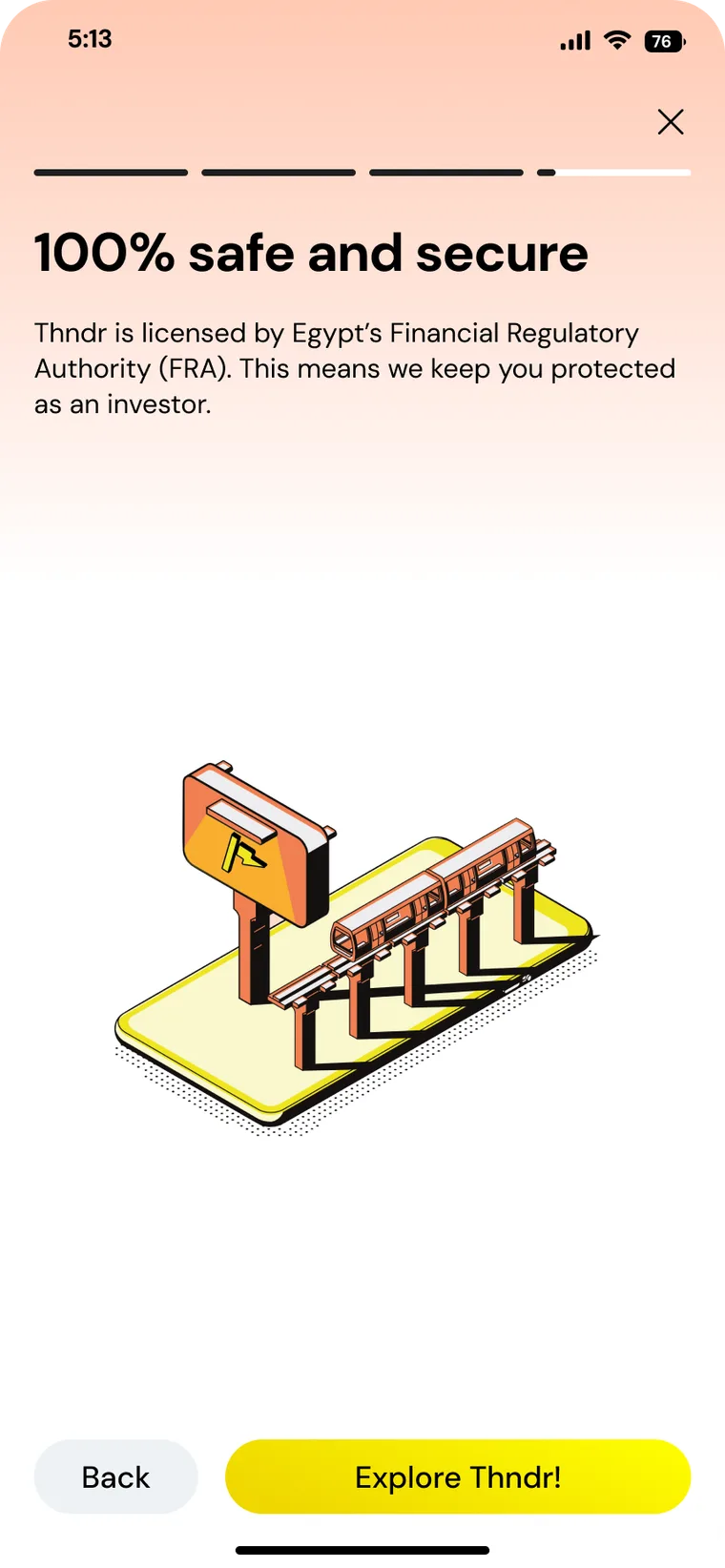
Regulation, up front — Licensing explained where trust is decided.
Click to enlarge
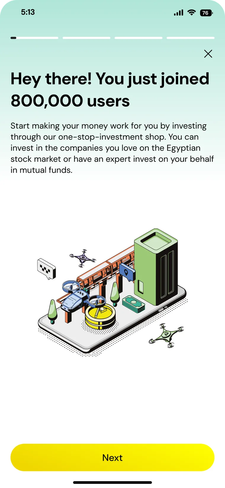
Social proof — 800,000 users, stated plainly.
Click to enlarge
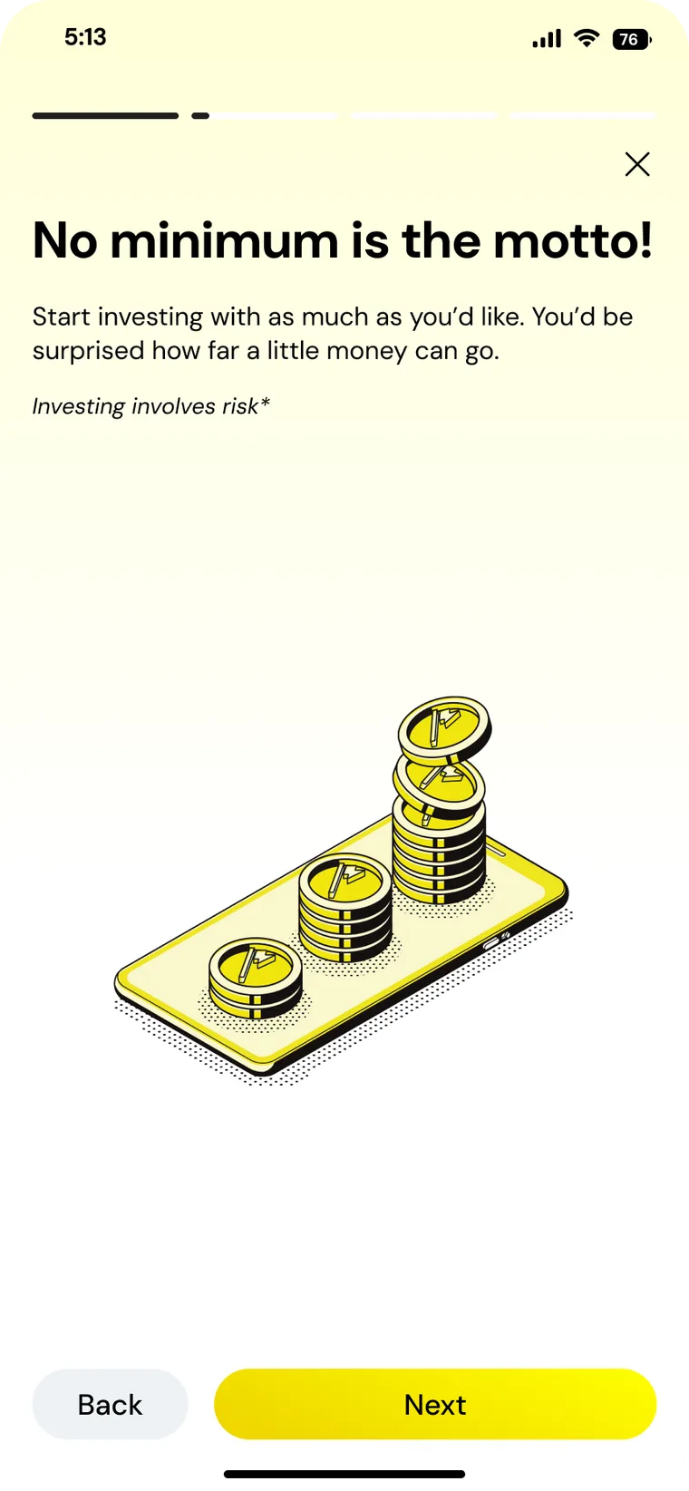
No minimum — Removes the biggest assumed barrier.
Click to enlarge
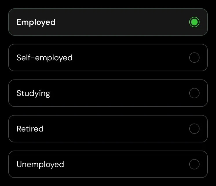
Job status — KYC broken into single questions.
Click to enlarge
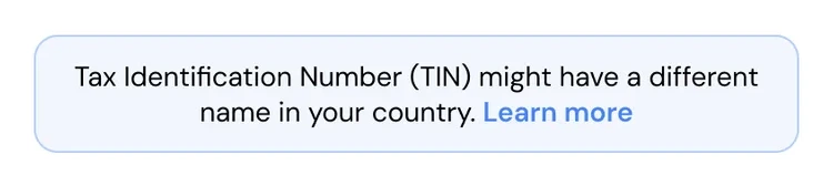
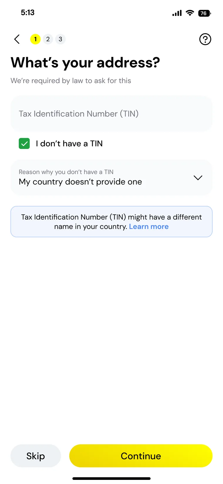
Tax residency — The heaviest step, made skippable.
Click to enlarge
ID capture — Clear rules for a good photo, before the camera opens.
Click to enlarge
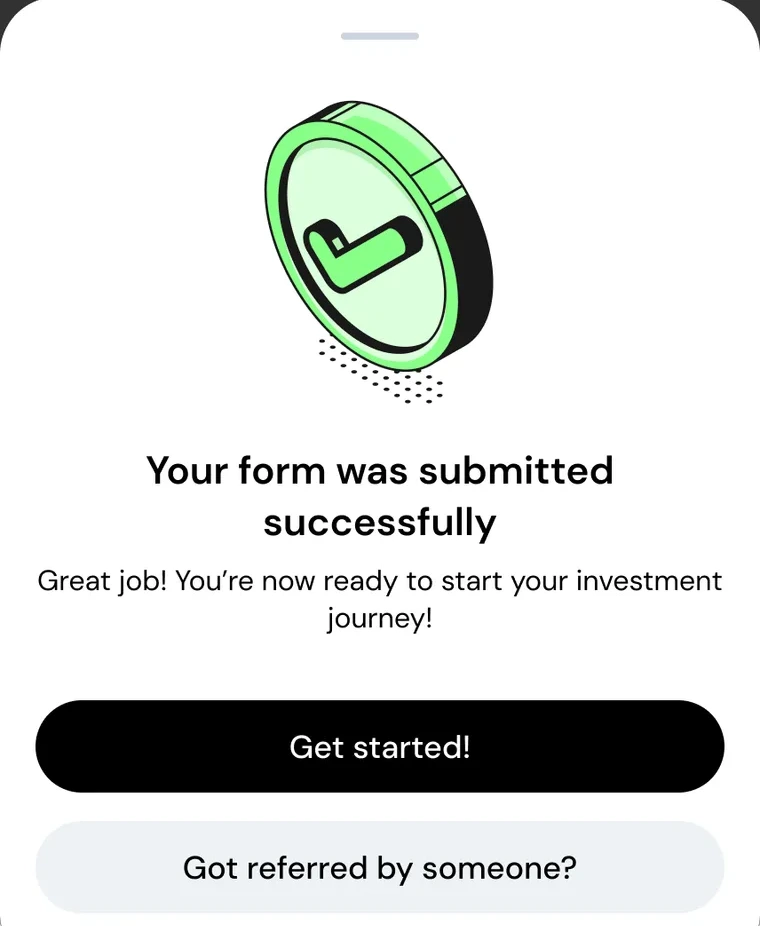
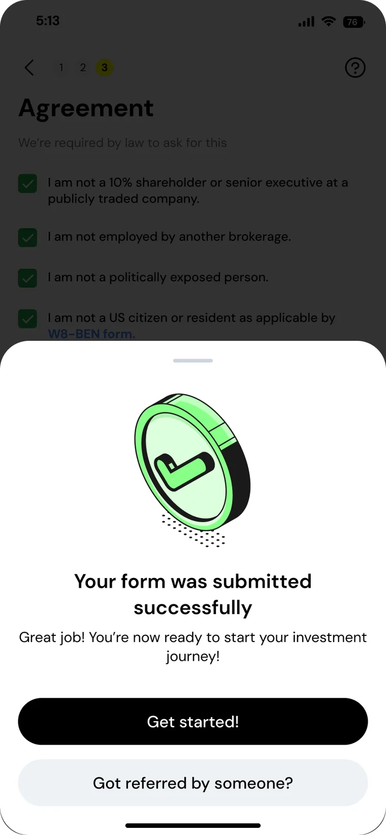
Submitted — Confirmation with an obvious next step.
04 Design systems and tokens synergy
Strengthened the synergy between the design system and design tokens, enabling scalable, consistent UI patterns and reducing friction between design and engineering during implementation.
16 components pulled from the shipped flow. Five are shown in both themes, so flip the switch.
ColourLight + darkValues sampled from the shipped screens
Primary action#F0DB01 → #FCF700
Role
Light
Dark
Background
#FFFFFF
#000000
Field
#F9FBFC
#171717
Secondary action
#EEF2F5
#171717
Selected
#15A63E
#33C836
Error #FA2C24
Link #4888F6
Hint #F2F6FE
In dark mode a single #171717 surface carries text fields, secondary buttons, the inactive stepper and the camera frame.
Camera frame · Photo rulesDarkID capture guide and the three failure states
Impact
Every UI change is coupled with UX impact
What the team tracked after the new onboarding shipped, and the design decisions behind each number.Hover a number to see what moved it
3M+Impacted users
One dot, about 50,000 people
What moved it
The flow and the components behind it reach everyone who opens or verifies an account on Thndr.
Arabic and English from the first screen
Light and dark mode from one token set
Components reused beyond onboarding
+27%CSAT
Before
After
Indexed: before 100, after 127
What moved it
Onboarding stopped feeling like paperwork.
Intro screens explain the app before any form
Regulation stated plainly, up front
One consistent system across every step
−15%Time on task
Before
After
Indexed: before 100, after 85
What moved it
Less hesitation at every KYC step.
One question per screen
Skip where the law allows it, like tax number
Photo rules shown before the camera opens
+11%Conversion rate
Before
After
Indexed: before 100, after 111
What moved it
More of the people who started the flow finished it.
Expectations set early: no minimum, 800,000 users
Three KYC steps, always visible in the top bar
Patterns benchmarked against Revolut and Trade Republic
What I took away
Onboarding got simpler and more consistent for users, and the product came out of it with a design system it could keep building on. Most of the value came from treating those as one project rather than two.
01
Align with engineering before the pixels
Agreeing on light and dark mode with engineering early saved a lot of back and forth later.
02
Friction is a timing problem
Better onboarding isn’t only better UI. It’s removing friction at the moments people are most likely to leave.
03
Pay for the system early
Investing in the design system up front made everything after it easier to scale and iterate on.











 Click to enlarge
 Click to enlarge
 Click to enlarge
 Click to enlarge
 Click to enlarge
 Click to enlarge